GuideRail
User Research
Usability Testing
Designing a supportive train navigation experience for anxious travellers
UI/UX
Tools
Figma, Figjam, Stark
Role
UX Researcher & UX Designer
Project Overview
Background
Public transport enables people to travel independently, but it can also be a source of anxiety. Unfamiliar systems, crowded stations, and the pressure of reaching the right destination on time can make train travel feel overwhelming, particularly for infrequent travellers who lack confidence using public transport.
Aim
This project aimed to explore how technology could better support anxious travellers throughout their journey. The goal was to design a train navigation experience that reduces uncertainty, builds confidence, and helps users recover quickly when unexpected situations arise.
Problem
Most transport apps are designed to help users reach their destination efficiently. However, they often assume users are already comfortable navigating public transport systems and provide limited support when disruptions occur, leaving anxious travellers without the reassurance or guidance they need.
Contribution
I led the end-to-end UX design process, from user research and insight synthesis to prototyping and usability testing. Using an iterative approach, I designed GuideRail, a mobile app concept focused on providing guidance, reassurance, and recovery support during train journeys.
Design Question
Define
Affinity Mapping
User Persona
Design Process


Ideate
How Might We (HMW)
Sketching
User Flow

Design
Wireframing
Prototyping

Test
Usability Testing
How might we make the public transport experience less stressful for anxious travellers?

Discover
Secondary Research
User Interviews
Understanding The User
Discover
Define
To design a solution that genuinely supported anxious travellers, I first needed to understand their experiences, behaviours, and pain points. Through user research and synthesis, I identified the moments that caused the greatest uncertainty and translated these insights into actionable design opportunities.
User Interviews
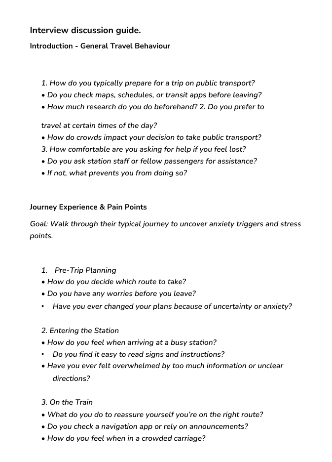
I conducted five semi-structured interviews with potential users who regularly experience anxiety when using public transport. These interviews explored:
Existing travel behaviours – how participants planned, navigated, and experienced train journeys.
Anxiety triggers – situations that caused uncertainty, stress, or a loss of confidence while travelling.
Current tools and coping strategies – how participants used existing navigation apps and the methods they relied on when things went wrong.
Support needs – what features or information would help participants feel more confident and reassured throughout their journey.
Synthesising Findings
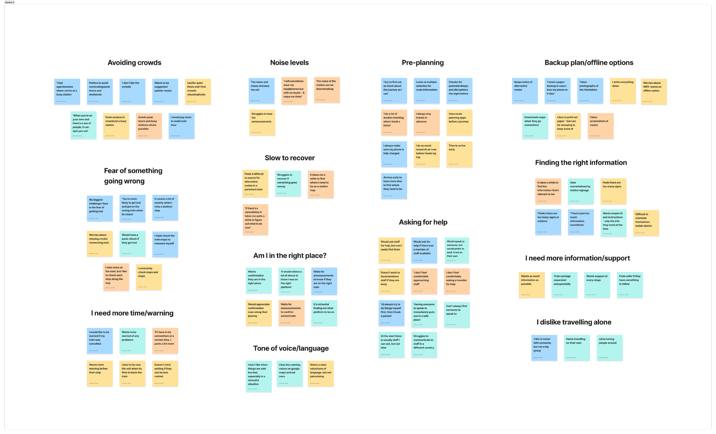
Interview responses were synthesised using an affinity map to identify recurring behaviours, pain points, and unmet needs. Grouping observations into themes helped transform qualitative research into actionable insights that informed the direction of the design.
Key Insights
Three key insights emerged from the research, each highlighting an opportunity to better support anxious travellers.
-
Participants consistently expressed anxiety around making mistakes during their journey, particularly missing their stop, boarding the wrong train, or experiencing delays. Many felt unsure how to recover when plans changed unexpectedly, leading to increased stress and a loss of confidence.
Design Implication: Design a proactive recovery system that detects disruptions and provides clear guidance on what to do next, reducing the cognitive effort required during stressful situations.
-
Busy stations, crowded platforms, and multiple sources of information often left participants feeling overwhelmed. Processing large amounts of information while navigating unfamiliar environments made it harder to stay focused and increased travel anxiety.
Design Implication: Present journey information in small, digestible steps with clear visual hierarchy, minimising cognitive load and helping users focus on one task at a time.
-
Alongside route information, participants wanted reassurance that they were progressing correctly throughout their journey. Clear guidance and confirmation at each stage helped users feel more confident, particularly when travelling alone.
Design Implication: Provide step-by-step navigation with timely prompts, contextual updates, and reassuring language to build confidence throughout the journey.
User Persona
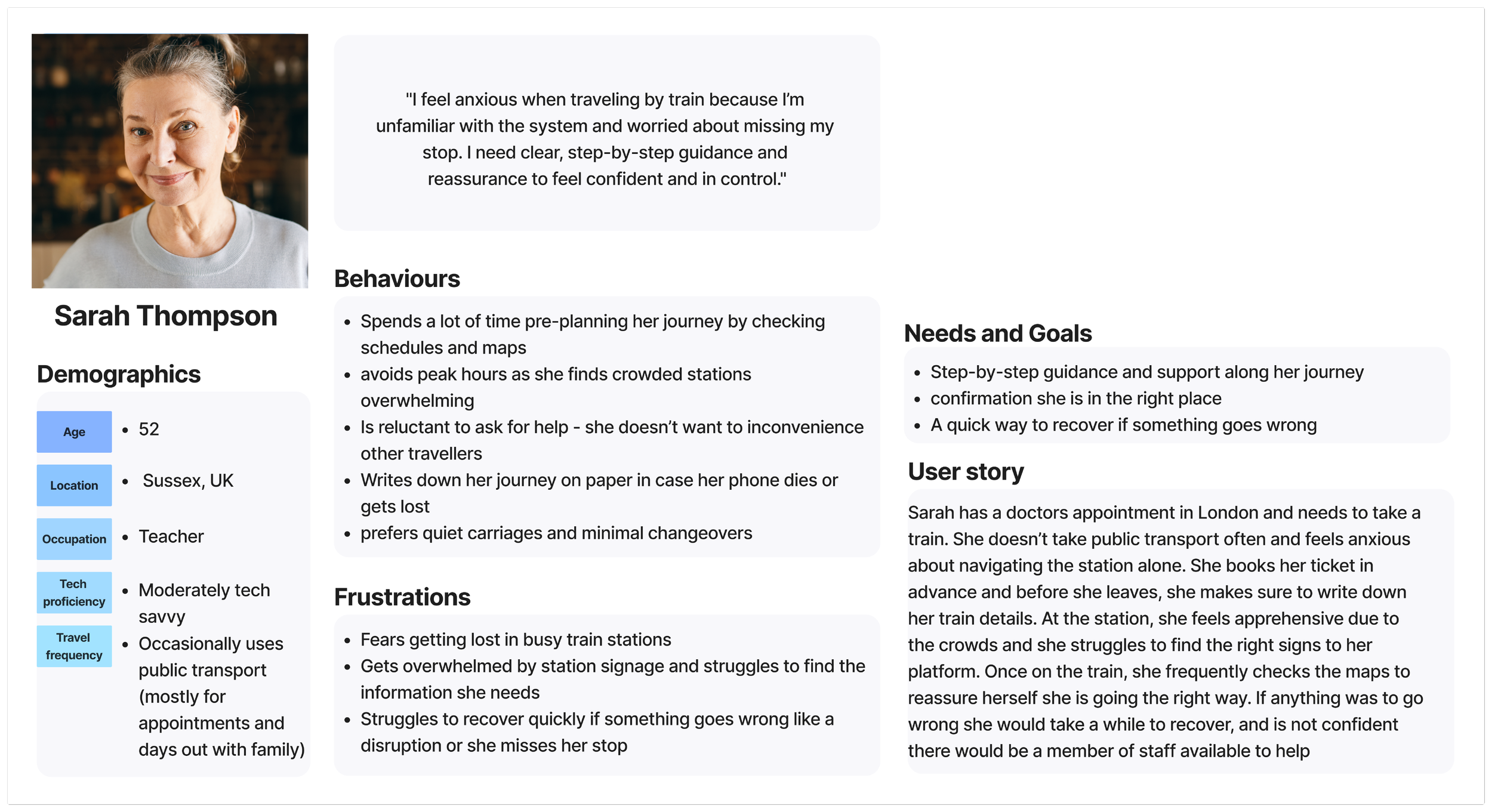
To synthesise the research into a tangible design tool, I created a primary persona representing the shared needs, behaviours, and frustrations of the target users. This ensured subsequent design decisions remained grounded in real user insights.
Sarah represents an occasional train traveller who experiences anxiety when navigating unfamiliar public transport systems. She values clear guidance, worries about making mistakes, and wants reassurance that she's on the right track throughout her journey.
Designing the Solution
Ideate
With a clearer understanding of users' needs, I began exploring potential solutions to address the key opportunities identified through research.
Concept Exploration
Using the refined design opportunity as a starting point, I explored a range of ideas through mind mapping and rapid sketching. This helped me generate and evaluate different approaches before deciding on the direction of the solution.
User Flow
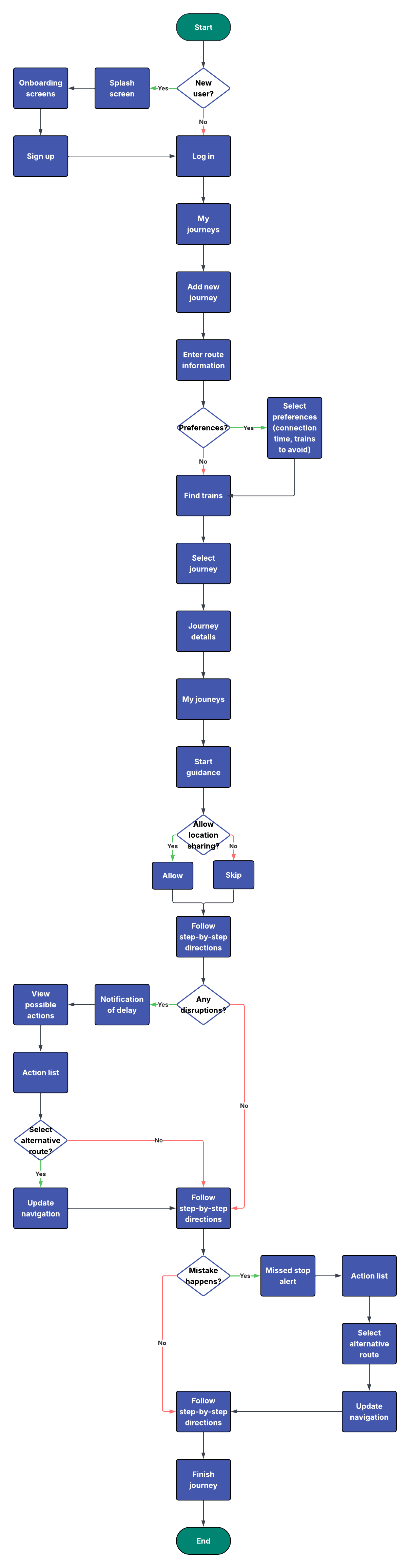
Once the core concepts had been defined, I created a user flow to map the end-to-end journey through the app. This helped establish the overall structure of the experience and provided a clear foundation for the wireframes by defining the key screens, interactions, and decision points before moving into interface design.
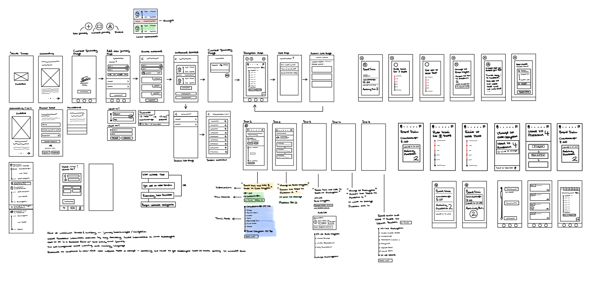
I explored concepts such as step-by-step journey guidance, visual cues for station navigation, and a recovery system for missed stops. Sketching allowed me to quickly iterate on layouts, interactions, and user flows before moving into digital wireframes.
Refined*
Design Question
How might we help anxious train travellers feel more confident by providing clear guidance, reassurance, and support when unexpected situations arise?
Refining the Experience
Design
Test
With the core experience defined, I translated the user flow into wireframes before developing an interactive prototype for usability testing. Gathering feedback throughout the design process allowed me to validate key decisions early and iteratively refine the experience into a clearer, more supportive journey for anxious travellers.
Early Wireframes & Feedback
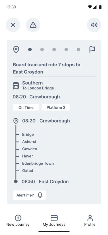
I translated the user flow into low-fidelity wireframes to explore screen layouts, information hierarchy, and interaction patterns before developing an interactive prototype. Gathering feedback at this stage helped validate the overall direction of the design before investing time in higher-fidelity prototypes.
Refined Wireframes
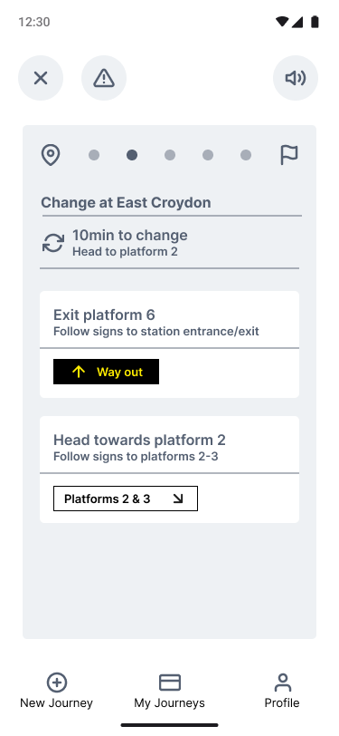
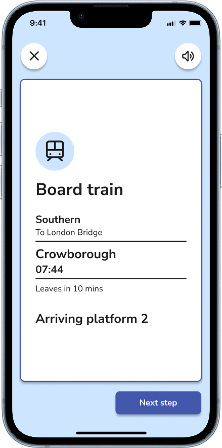
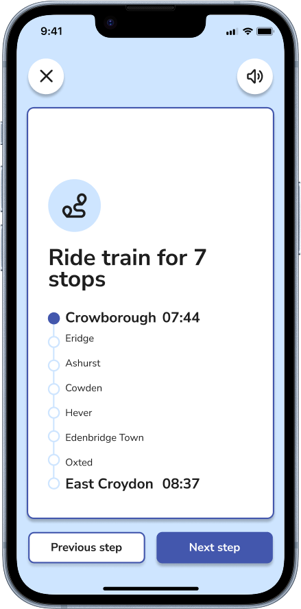
Using this feedback, I redesigned the step-by-step navigation flow before moving into prototyping. The step cards were simplified with a clearer content hierarchy, increased white space, and concise, action-oriented instructions that guided users through one task at a time.
Finding
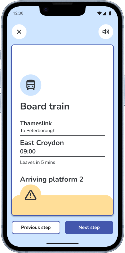
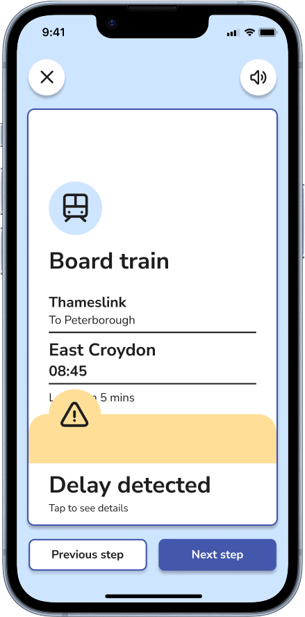
Users often failed to recognise that the delay notification was interactive. Although they noticed the alert, many didn't realise they could tap it to view additional information about the disruption.
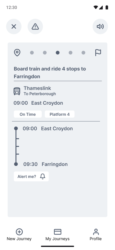
While users understood the core navigation flow, they found the step cards contained too much information and felt too similar to existing navigation apps. Although the interface successfully communicated how to complete the journey, it did little to reduce users' anxiety or provide reassurance throughout the experience.
This highlighted the need to simplify the navigation flow and focus on presenting only the most essential information at each stage of the journey.
Guided Navigation
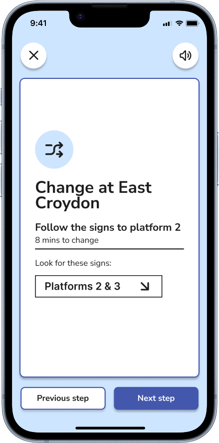
GuideRail breaks each journey into clear, step-by-step instructions, helping users focus on one action at a time rather than processing large amounts of information. The redesigned step cards use concise, action-oriented copy, improved visual hierarchy, and generous white space to reduce cognitive load while travelling through unfamiliar environments.
This approach creates a calmer navigation experience, allowing users to feel more confident as they progress through each stage of their journey.
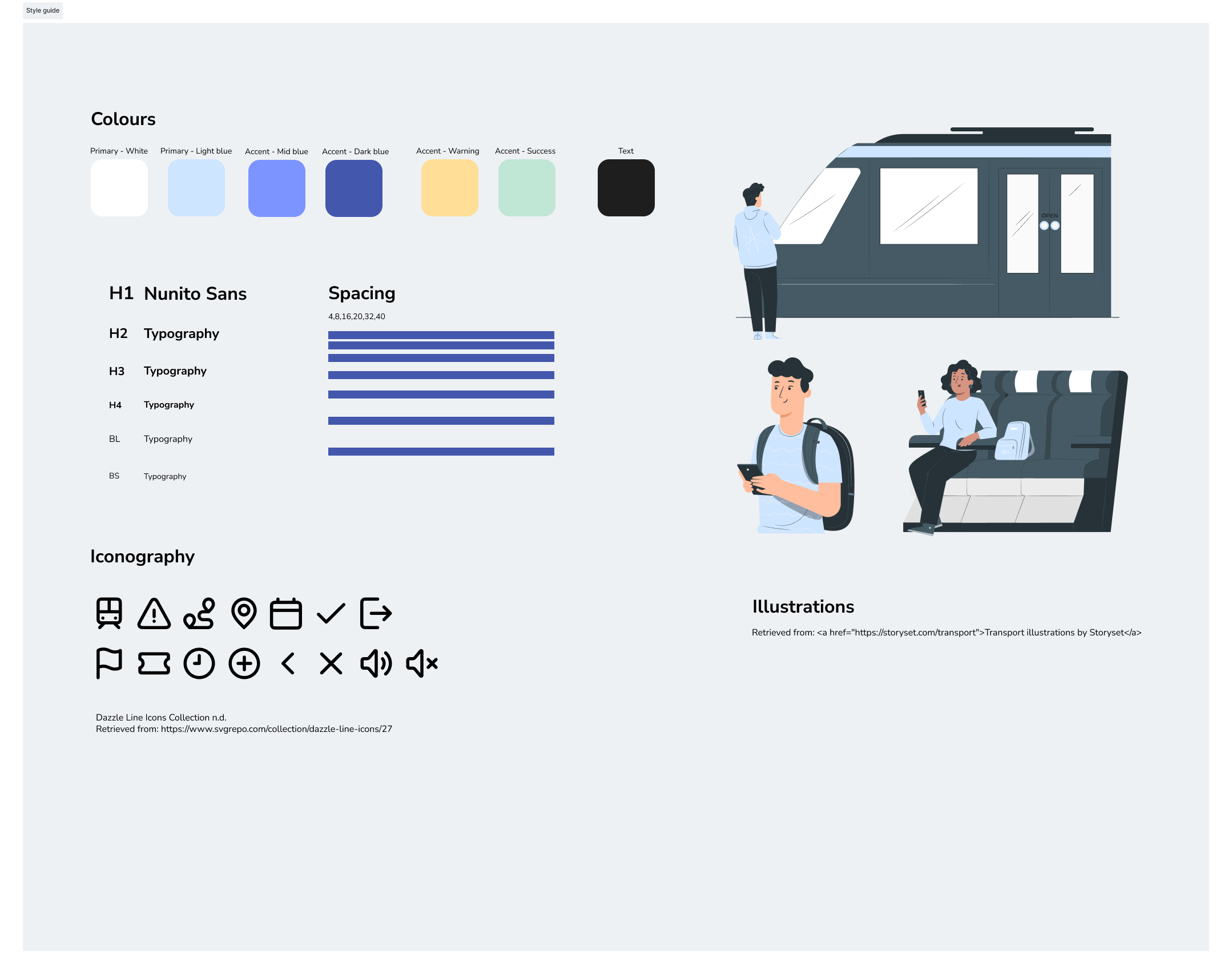
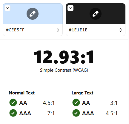
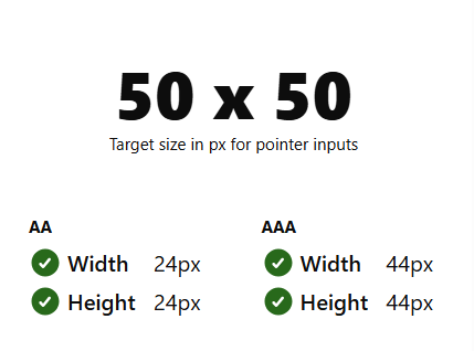
Accessibility remained a key consideration throughout the design process. Using Stark and Figma's accessibility tools, I evaluated colour contrast, touch target sizes, and readability against WCAG guidelines. Where necessary, I made refinements to ensure the interface was inclusive, accessible, and easy to use.
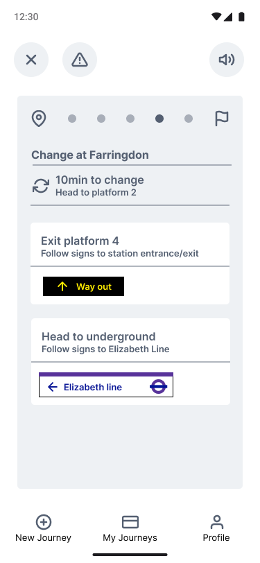
By reducing unnecessary information and improving the visual hierarchy, the revised wireframes created a calmer, more focused experience while lowering cognitive load. These refinements formed the foundation of the interactive prototype used in the next round of usability testing.
Confidence
Did users feel comfortable following the guidance provided?
Clarity
Were the navigation steps and recovery flows clear and intuitive?
Before
Key Learnings
After
Iteration 2 | Clarifying the Alternative Route Flow
‘So I am choosing between these two options?’
Usability Testing
Building on the refined wireframes, I developed an interactive prototype and conducted think-aloud usability testing to evaluate how effectively GuideRail supported anxious travellers throughout their journey.
The testing focused on three key objectives:
Recognition
Could users understand alerts and system feedback?
Positive feedback highlighted the app's calm visual design, clear step-by-step guidance, and the reassurance provided during recovery scenarios. Testing also uncovered several usability issues that informed the final design.
Iteration 1 | Improving Delay Alert Discoverability
‘I assume this is telling me my train is arriving?’
Iteration
To improve discoverability, I added contextual copy explaining the delay alongside a clear call-to-action beneath the alert. This made it more obvious that users could tap the notification to view delay details and alternative route options.
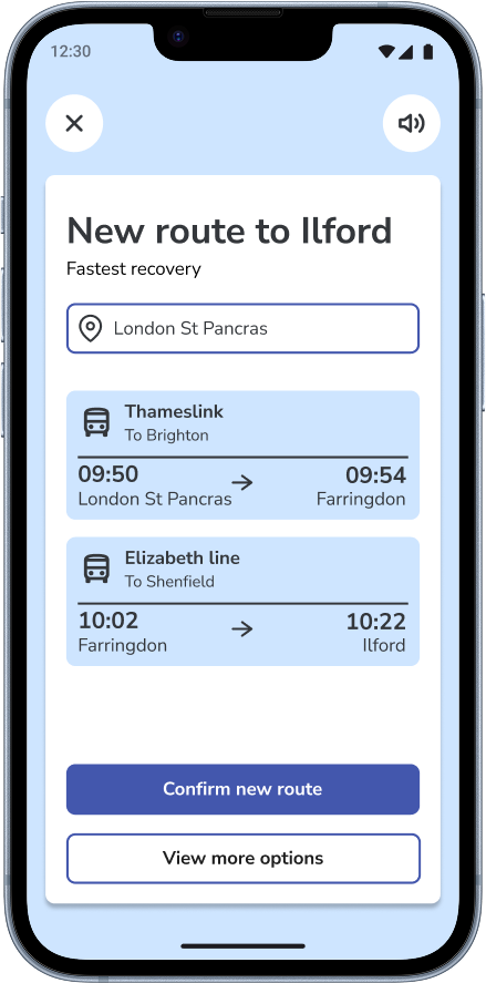
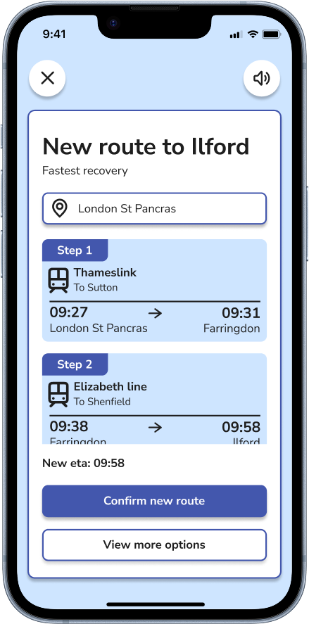
Finding
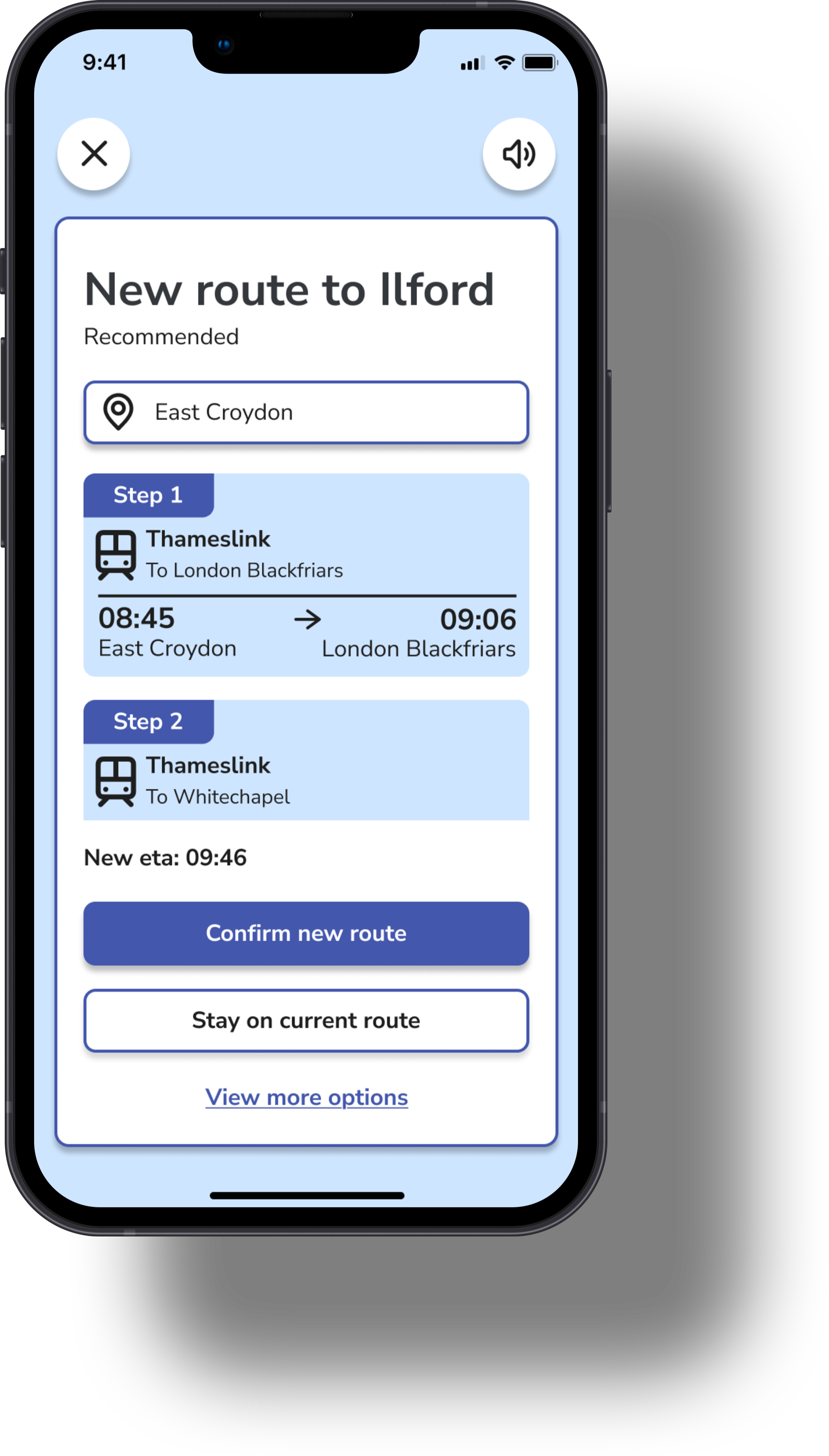
Users initially interpreted each navigation card as a separate route option rather than individual steps within a single recommended journey.
Iteration
I first introduced numbered icons to communicate sequence, but testing showed they were still open to interpretation. Replacing these with explicit ‘Step 1’, ‘Step 2’, and ‘Step 3’ labels successfully clarified the intended flow.
Before
After
Accessibility
Addresses: Sensory Overload
Visual Design
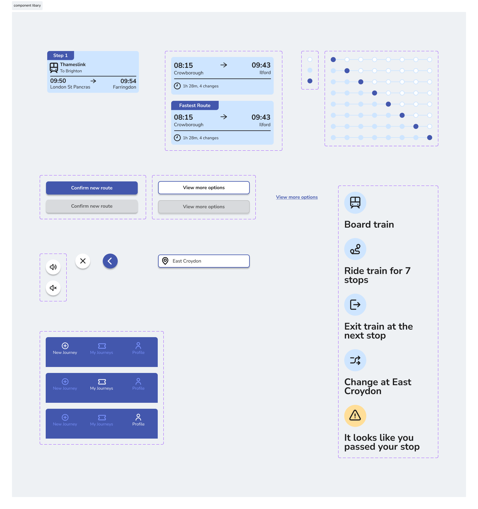
My visual design choices were guided by the emotional needs of my users. I used shades of blue throughout GuideRail to create a sense of calm and trust, qualities that are especially important for users who may be feeling overwhelmed or anxious during their journey.
For typography, I chose Nunito Sans, a well-balanced sans serif typeface that feels friendly and reassuring while offering excellent readability on mobile devices. Together, these design choices create a visual language that is both supportive and easy to navigate under pressure.
Final Design
GuideRail was designed to reduce anxiety throughout the train journey by providing clear guidance, proactive support, and reassurance when plans change. The final experience centres around three core features, each directly informed by the research insights gathered during the project.
Real-Time Journey Support
When delays or disruptions occur, GuideRail proactively informs users with contextual updates and clear next steps. Rather than requiring users to search for information themselves, the app explains what has happened and provides alternative route options when needed.
By presenting timely updates in a clear and reassuring way, users can make informed decisions without feeling overwhelmed.
One of the biggest takeaways from this project was learning how small design decisions can have a significant impact on a user's experience. Refining elements such as information hierarchy, interaction cues, and content clarity showed me how thoughtful iteration can improve both usability and user confidence.
Next Steps
The next step would be to evaluate GuideRail in real train station environments, observing how users interact with the app under genuine pressures such as crowds, distractions, and service disruptions. I'd also explore personalisation features, such as avoiding busy stations or minimising transfers, to better support different user preferences and comfort levels.
Addresses: Need for Reassurance
Proactive Recovery Support
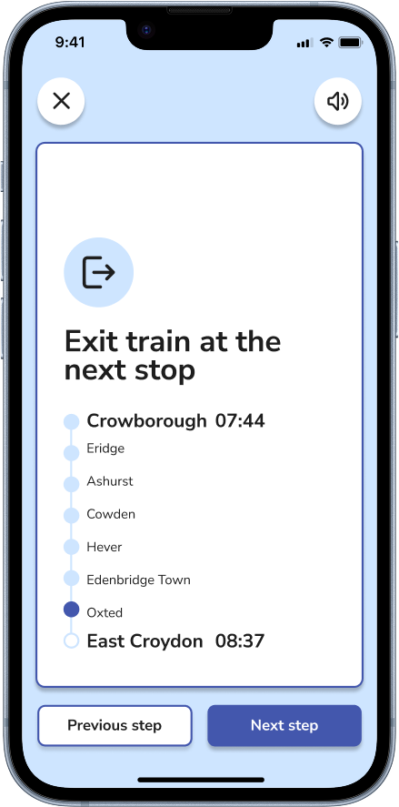
The recovery experience is designed to help users regain confidence when unexpected situations occur. If a user misses their stop, GuideRail automatically detects the issue, prompts them to exit at the next station, and recommends a new route back to their destination.
This proactive approach removes the burden of deciding what to do next during stressful moments, reducing uncertainty and helping users recover quickly with confidence.
Addresses: Fear of Things Going Wrong
Thanks for reading!
Want to explore the full experience?
View the interactive Figma prototype